What’s trendy in graphic design right now? A lot of people have asked me to talk about design trends. Let’s see what solutions will be popular in the coming year.
This is a really fascinating topic, because some trends change slowly from year to year (remember how long the evolution of flat design lasted and what level it has reached now), while others appear and disappear in the blink of an eye.
Do you have to chase the fashion and always use the latest graphic design trends in your work? Of course not. However, by studying them you will find new ideas, inspiration and learn which methods and styles define the vector of development of our industry.
Inclusive Visual
Whatever project you’re working on-whether it’s a website, printed materials, or a poster-focus on making sure the visual is inclusive.
By visual, I mean images, videos, illustrations, icons. Sounds and voices play an equally important role. Whereas images of white males used to be the standard, now designs should include people of different races, genders, sizes, as well as people with disabilities.
The desire to make designs more inclusive is part of a global trend that is permeating the field of graphic design. This approach allows brands to reach a broader audience and gives designers new tools and ideas.
This trend not only defines what a visual should be, but also helps you better understand the people for whom you create your designs.
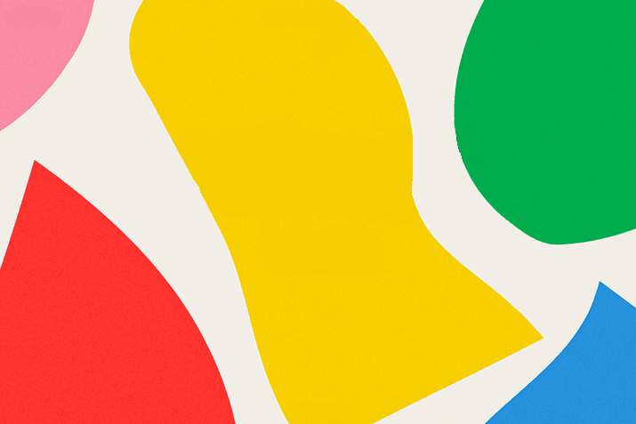
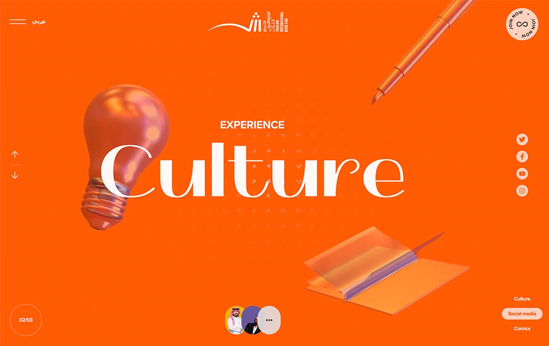
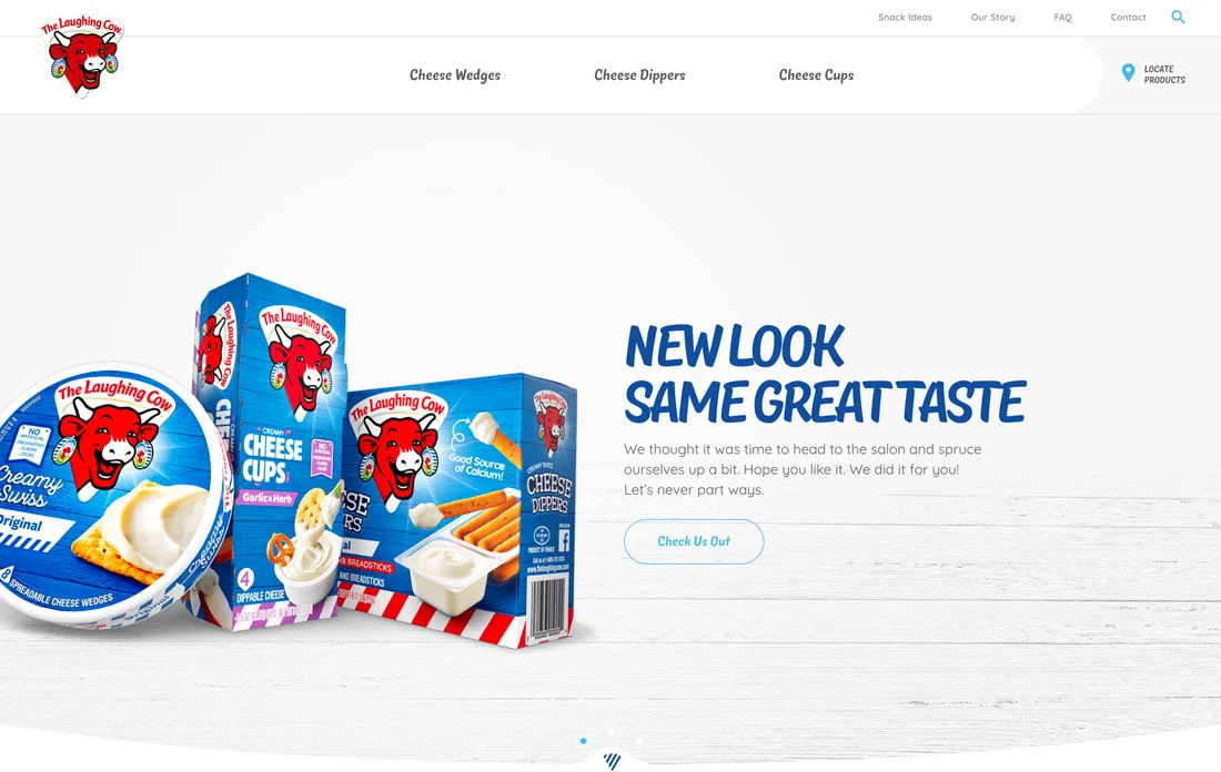
Background with bright graphic elements
It’s time to play with the backgrounds a little. Forget the minimalism that used to be popular and be bold!
Bright, bold designs are on trend right now, from colors to patterns and effects that look appropriate in the foreground as well as in the background. Such solutions work because they’re sure to grab users’ attention.
Catchy backgrounds (especially layered ones) combined with simple typography and other design elements look stunning. Bold can be the color, pattern, size of objects in the background or, if it’s a website, animation effects.
For such a solution to work, you need to make sure that all the elements are in their places, and the view moves smoothly between them. If the background is bright, the objects in the foreground should be larger and more massive – enough contrast will ensure optimal readability.
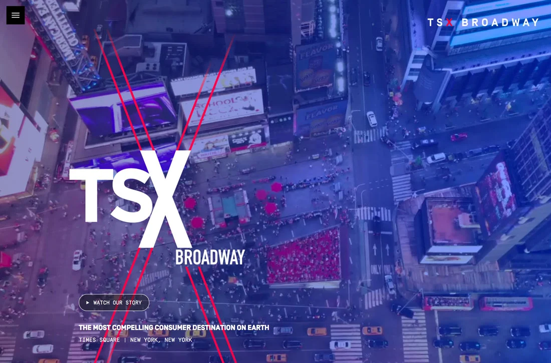
Text with overlay effects
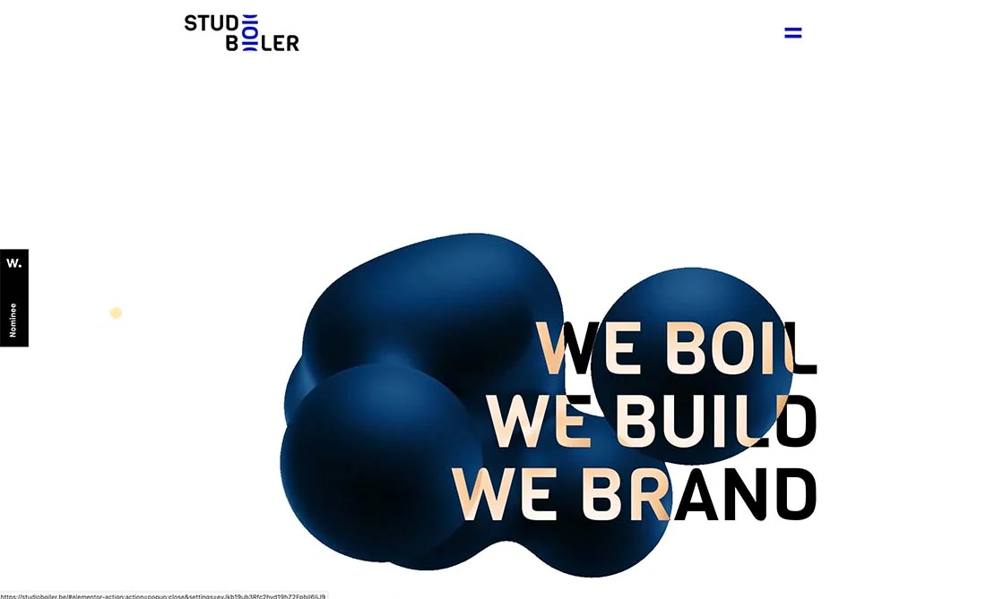
Layered text is a technique that has long been used by graphic designers in print materials, but now it’s spreading to Web sites.
By layering text with certain effects-color, animations, different sizes of text-you can make typography the centerpiece of your design.
The examples above use two completely different approaches, but both are equally successful:
- Studio Boiler uses animation and color to draw users’ attention to a rather long title. Just look at how beautifully the hue of the text changes as the animated blob moves.
- On Mrs. & Mr.’s site, you’ll see contrasting text layers that immediately catch the eye and pique interest. Bold choices in lettering, size, and animation effects make for a simple but impressive design.
But be careful – if the typography isn’t perfect, the text won’t make the right impression. Make sure all text elements are readable and help users understand why they’re interacting with your design in the first place.
Images without faces
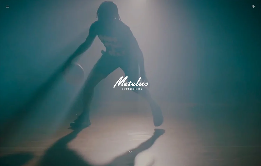
Should photos show a face? This is a big question for designers and brands alike. Nowadays, “faceless” images are becoming more and more popular.
We’re talking about silhouettes or photos that show people with their backs to the viewer. This approach has two purposes. First, it allows designers to work with images that the brand already has without additional photo shoots, and second, it prevents users from having any complexes about their appearance.
In addition to reducing the number of images with faces, the number of group photos is also reduced.
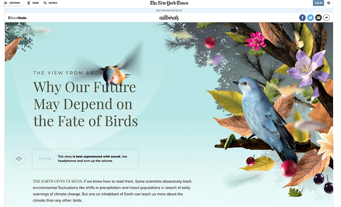
Large elements
Large elements, from images to typography, now dominate both digital and print graphic design.
Digital projects often feature a combination of such elements and animations or scrolling effects that allow users to see the whole image. Large objects attract attention, so people are happy to interact with them.
Another feature – large elements are often superimposed on each other, for example, images on the text and vice versa. Although it is not recommended to do so, such solutions are becoming increasingly popular.
This approach can be effective if applied to simple typography: 1 or 2 words that will be clear, even if you close some letters. In this case, the result will be beautiful and impressive.
Experimental typography
We are talking about experimental fonts. They come in a variety of styles and types and are capable of decorating any project with their modern, unique look.
Any font that differs from the standard options can be called experimental, for example, a font with sharp and unusual strokes, animation effects, 3D elements, illustrations and other original stylistic solutions. It is easy to remember, because there are no analogues of this font.
The main advantage of experimental fonts is that they look in the design as if they were specially created for a particular project on an individual order.
“Natural” design
In recent years, brands have been striving to create more authentic designs that help them strengthen their relationship with their audiences. That’s how the “naturalness” trend came about.
This kind of look is deceptive – the design looks like there is no design at all. However, to achieve the desired effect is quite difficult, because it is necessary to create a visual that will look natural, simple and fresh, as if it had just been drawn by hand.
You will immediately recognize “natural” design elements, because they always resonate with the audience and look like “anyone could have invented and made that. (Yes, designers aren’t too happy to hear such comments, but that’s the peculiarity of this visual aesthetic).
“Natural” design uses simple logos without complex color combinations or graphic elements (think of the styles that are popular with startups), familiar colors and typography. In an integrated approach, products are made from environmentally friendly materials, as is the packaging.
Massive typography
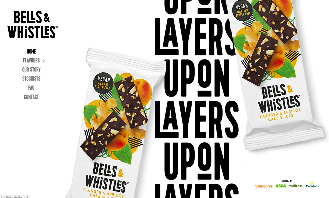
At the other end of the spectrum is the trend of 2021: massive typography. Large fonts with thick strokes seem to be everywhere. Many of them are unusually shaped, include animations or other details to attract visitors’ attention.
This trend certainly can’t be called boring. Most surprisingly, some of the fonts are not highly readable, but they are memorable and catch the interest of users.
To make it work, make sure the supporting text and graphic elements are easy to understand. They should have a simple form and functionality to counterbalance the massive, showy typography.
Such a style is best suited to well-known, popular brands whose look, feel and voice are already familiar to users. Even if they can’t read all the words on the site, they’ll know where they are thanks to uniform branding.
Voice and sound
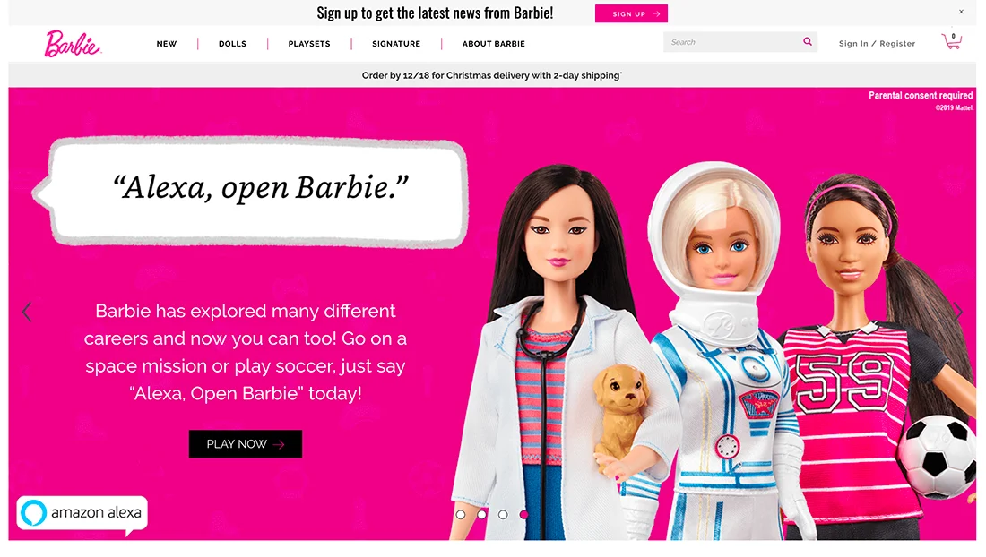
Hi Alexa…
The biggest trend of 2021 you won’t see, but hear. Adding voice messages, audio recordings and other interactive elements to interfaces for audio playback is an important step, because many of us use voice interfaces all the time! The key to success is useful and valuable content. (And also functional code ☺️)
But it’s not just about voice interfaces – sound can also be used in website design. Users are used to talking to devices, watching videos, so they’ll be happy to interact with those interface elements that involve sound playback.
Make it easy for people to launch audio or video themselves with a click/tap – automatic playback is still considered bad form.
3D effects and depth
Graphic design is becoming more and more realistic. We see 3D elements everywhere, as if they were jumping out of the screen. The popularity of the trend is growing by leaps and bounds. It’s something of a return to skeuomorphism, but this time the graphics are more believable than ever.
In the digital world, 3D shapes often exist in combination with animations that animate them. They usually move slowly, along a certain trajectory, as realistically as possible. (It takes a lot of effort to make an object on the screen look and move like the real thing, but the result is worth it!)
Try to tell a story in 3D. Users shouldn’t have any questions about why elements look and move the way they do.
Bright colors
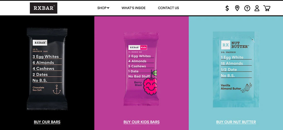
Choosing vibrant hues for everything from backgrounds and images to user interface elements has been one of the biggest trends since 2018.
Vibrant, colorful color palettes have dominated websites, promotional materials, and other projects. Many bright and bold colors were borrowed from material design, such as blue, purple, and pink.
These shades are now particularly common in product and packaging design, and they certainly have a place on the websites of the respective brands as well. The RXBar site pictured above is a great example of this trend. Each color is unique, and the packaging and site design match each other perfectly.
In addition, designers have turned more often to palettes of multiple colors, breaking the classic rule of 2-3 shades. This year, sites with lots of bright colors, interesting shapes and unusual typography were especially popular.
Three-dimensional real objects
Designers seem to like developing three-dimensional projects. Many websites now feature three-dimensional compositions of real objects. This approach makes it possible to create an extremely attractive image of the product, as well as to demonstrate how it looks in life.
It takes a lot of effort and time to develop such interfaces, although at first glance the design may seem simple. Show a little imagination, and users will be delighted with your site.
Gradients
Gradients are everywhere these days – backgrounds, video or photo overlays, illustrations, the list goes on and on. In recent years, they have played an important role in design. Bright hues that used to be popular on their own are now used as part of trendy gradients.
However, not all trendy gradients look bright and bold. Some of them turn out to be more delicate, with soft color transitions. They can be used in the design of real products, as well as in illustrations or typography.
Animated shapes
There is something magical and grandiose about animated abstract forms. Such “formless” objects move slowly (and sometimes not so much) across the background. They can be large or small, and are often painted in bright colors and act as a main accent, which attracts the eye and helps users navigate the interface.
The main advantage of the trend is that you can effortlessly create a trendy and fresh design. Add fun animations or patterns, and your project is sure to appeal to users, even if it lacks other images or videos.
This is the reason why startups and small brands who want their websites to look innovative most often turn to the trend.
Minimalistic navigation

Mega menus were in vogue a few years ago. Since then, the trends have changed and now on many sites you can find minimalistic and even sometimes hidden navigation elements.
This solution came from the design of mobile applications (because it is smartphones and tablets that users mostly use to view sites). This saves space on the screen and makes the experience of interacting with the interface uniform.
Although “almost invisible” navigation has its pros and cons, the minimalistic, free interface and many creative ways to hide “annoying” navigation elements are undeniable advantages of this approach.
Above you can see 2 completely different examples: Blab’s website designer adds a square menu button to the bottom left corner of the screen. But the navigation on Le Mordue’s site doesn’t appear at all until the user starts scrolling the page.
Authentic photos
As all brands today strive to build sincere relationships with their audiences, authentic, non-ideal images prevail in design. Even commercial photography is becoming more and more like natural snapshots from ordinary life.
And while such images may be slightly edited, they work great because they feel more real. The trend is also spreading to other brand communication channels with the audience, such as social media.
Of course, you can use stock images, though you’ll have to sweat to find the right ones. Your best bet is to talk to your photographer/videographer about the kind of visual you want to create. Remember that authentic doesn’t mean unprofessional, it’s just a different style.
Since today’s monitors are high resolution, image quality plays an important role. And although the style of photos will be more relaxed and simple, their quality should not get worse.
Conclusion
Which of the solutions you reviewed would you like to see in your designs next year? I like these concepts because they can easily be put into practice. There’s nothing better than a design that combines beauty and usability.